

User Experience (UX) Design is a field that requires a keen eye for detail, a deep understanding of user behavior, and a creative approach to problem-solving.
However, even the most experienced designers can face creative blocks or struggle to translate user feedback into actionable design improvements.
But what if there was a tool that could help you brainstorm, plan, and refine your designs? A tool that could provide you with helpful prompts to guide your creative process?
In this blog post, I'll show you a collection of ChatGPT prompts built specifically for UX designers. These prompts will help you understand your users better, generate innovative design ideas, and ultimately create a more impactful user experience.
These are the best ChatGPT Prompts for UX design:
- Generate design concepts
- Suggest color scheme
- Generate wireframes
- Craft user personas
- Create user flows
- Generate survey questions
- Write design guidelines
- Write project briefs
In the next section, we'll take a closer look at each aspect of UX design (along with the prompt examples). And if you read till the end, you'll also find a little tip to use these prompts more effectively.
ChatGPT Prompts for UX Designers
In this section, we go through the prompts. These prompts will guide you through design processes, idea generation, and problem-solving, helping you to create better user experiences.
1. To Generate Design Concepts
The first prompt we'll take a look at is for generating design concepts. As we know, coming up with innovative design concepts is a fundamental aspect of UX design. However, brainstorming can sometimes feel like hitting a wall.
And that's what the prompt below is trying to solve.
As a seasoned UI/UX designer, use your years of experience and knowledge of current trends to generate a list of innovative design concepts for a [type of website/app]. These concepts should be reflective of the brand's identity and cater to the user's needs, while also pushing the boundaries of traditional design. Consider the latest trends and technologies in UI/UX design and how they can be incorporated. Additionally, ensure that the designs are user-friendly, intuitive and enhance the overall user experience. Each concept should be unique, creative and have the potential to set the brand apart in the market. Please provide a brief description and sketches/visuals for each concept.This prompt was generated by our ChatGPT prompt generator.
Example: Generate concepts for a fitness training website.
As a seasoned UI/UX designer, use your years of experience and knowledge of current trends to generate a list of innovative design concepts for a fitness training website. These concepts should be reflective of the brand's identity and cater to the user's needs, while also pushing the boundaries of traditional design. Consider the latest trends and technologies in UI/UX design and how they can be incorporated. Additionally, ensure that the designs are user-friendly, intuitive and enhance the overall user experience. Each concept should be unique, creative and have the potential to set the brand apart in the market. Please provide a brief description and sketches/visuals for each concept.
Here are some innovative design concepts for a fitness training website that combine cutting-edge trends in UI/UX with a focus on brand identity and user experience. While I cannot provide physical sketches here, I can describe the concepts in detail and the visuals that might accompany them.
1. Personalized Fitness Dashboard
- Concept: A dashboard that is fully customizable to reflect each user's fitness journey, showcasing their progress, workout history, upcoming goals, and motivational elements.
- Unique Feature: Interactive widgets that users can rearrange and personalize to create a fitness space that reflects their unique goals.
- Trends Incorporated: Personalization, minimalist design, micro-interactions (e.g., progress bars, animated notifications).
- Sketch/Visual: Imagine a clean, modular interface with vibrant progress circles, adjustable cards, and subtle animations on data update, creating an engaging experience.
2. AI-Powered Virtual Trainer
- Concept: A virtual AI trainer that offers real-time feedback during workouts, tailored exercise plans, and nutrition advice based on user inputs like body type, goals, and preferences.
- Unique Feature: Integrated AI using natural language processing to adjust workouts dynamically, offering both voice and on-screen guidance.
- Trends Incorporated: AI integration, voice UI, and conversational interfaces.
- Sketch/Visual: A 3D-rendered character or minimalistic visual representation guiding users through their workout with split-screen features showing exercise instructions and real-time AI feedback.
3. Gamified Fitness Challenges
- Concept: Gamification elements like daily challenges, badges, leaderboards, and streaks that make workouts more engaging.
- Unique Feature: Incorporates social features where users can challenge friends, track their rankings, and unlock rewards.
- Trends Incorporated: Gamification, social UX, badges/achievements, community engagement.
- Sketch/Visual: A vibrant, energetic UI with leaderboards, achievements popping out, and the ability to see friends' progress in real-time. Bright colors and dynamic animations would drive engagement.
4. Augmented Reality (AR) Training
- Concept: An AR experience that overlays exercise instructions and progress data onto the user's environment, guiding them through workouts in real-time.
- Unique Feature: Allows users to see correct form, reps, and pacing in an immersive environment.
- Trends Incorporated: AR/VR technologies, immersive experience, and wearable tech integration.
- Sketch/Visual: An augmented overlay showing a virtual trainer demonstrating a proper push-up or squat, with visual cues for alignment or performance metrics (e.g., form corrections).
5. Interactive Progress Map
- Concept: A visual progress map where users see their fitness journey as a path with milestones, representing different phases of their fitness goals.
- Unique Feature: Users unlock new "destinations" on their fitness journey, each representing different achievements like weight loss, strength gains, or running longer distances.
- Trends Incorporated: Journey mapping, milestone-based UX, data visualization.
- Sketch/Visual: A stylized map that visually represents progress, with vibrant, dynamic waypoints lighting up or animating as users unlock new milestones.
6. 3D Immersive Workout Sessions
- Concept: Virtual 3D environments where users can perform workouts as if they're in a fitness studio, with guided sessions from trainers in virtual spaces (think yoga in a zen garden, HIIT in a virtual gym).
- Unique Feature: 3D rendering of trainers, gym environments, and even customization options for the users’ own avatars.
- Trends Incorporated: 3D modeling, immersive experiences, and customization.
- Sketch/Visual: A fully immersive 3D space with visual detail—users see themselves performing workouts in a chosen environment, led by a dynamic 3D trainer.
7. Real-Time Social Workout Sessions
- Concept: Create real-time workout sessions where users can join friends or trainers in live classes or group fitness challenges.
- Unique Feature: Users can see real-time data like heart rates, reps, and form corrections of their peers, enhancing motivation.
- Trends Incorporated: Real-time interaction, live streaming, collaborative UX.
- Sketch/Visual: A split-screen view with live-streamed workouts on one side and user data (like calories burned or heart rate) on the other. The interface should have clear and simple real-time notifications or updates about teammates’ progress.
8. Minimalistic, Focus-Driven UI with Smart Automation
- Concept: A minimalistic design focused on reducing cognitive load with a distraction-free interface. Integrated with smart automation, this UI predicts and prepares workout plans based on user preferences and past behavior.
- Unique Feature: Voice-enabled controls and auto-suggestions for exercises based on workout history and goals.
- Trends Incorporated: Minimalism, automation, predictive UX, voice-activated UI.
- Sketch/Visual: A clean interface with smooth transitions and smart workout suggestions popping up in an unobtrusive way. Simple, bold fonts and ample whitespace guide focus to key actions.
These ideas can combine innovative technology and the latest UI/UX trends to create a fitness website that feels personal, engaging, and futuristic. Would you like a specific visual layout for any of these concepts?
2. To Suggest Color Scheme
Choosing the right color scheme is an integral part of UX design that can significantly impact user experience. And with the help of the next prompt, you can generate color scheme suggestions that perfectly align with your design goals.
As a highly experienced UI/UX designer who has collaborated with major brands, utilize your expertise to suggest a color scheme for a [type of website/app] that targets [target audience]. The color scheme should align with the brand's identity and appeal to the target audience, enhancing user experience and driving engagement. Take into account color psychology, accessibility standards, and current design trends. Provide a detailed rationale for your choices, and if possible, visual examples of how the colors would look within the UI design.This prompt was generated by our ChatGPT prompt generator.
Example: Generate a color scheme for a fitness training website.
As a highly experienced UI/UX designer who has collaborated with major brands, utilize your expertise to suggest a color scheme for a fitness training website that targets [target audience]. The color scheme should align with the brand's identity and appeal to the target audience, enhancing user experience and driving engagement. Take into account color psychology, accessibility standards, and current design trends. Provide a detailed rationale for your choices, and if possible, visual examples of how the colors would look within the UI design.
To create a compelling color scheme for a fitness training website targeting [target audience], let's break it down step by step based on best practices and design considerations.
1. Define the Target Audience:
Without knowing the exact target audience, let's assume a general fitness audience, potentially spanning ages 18-45, interested in health, wellness, and an active lifestyle. If the audience skews towards a more specific group (e.g., beginners, bodybuilders, or yoga enthusiasts), that would fine-tune the color choices.
2. Core Color Psychology in Fitness:
- Energy and Motivation: For a fitness website, colors that evoke energy, motivation, and vitality are essential. Warm colors like reds and oranges are known to stimulate action and excitement.
- Trust and Stability: Blues are often used to convey trust and professionalism.
- Balance and Calm: For aspects like recovery, wellness, or mindfulness, softer colors like greens and neutral tones can evoke calmness and balance.
3. Proposed Color Palette:
-
Primary Color: Vibrant Orange (#FF6B35)
- Rationale: Orange is energizing, often associated with activity and enthusiasm, which fits a fitness-focused brand. It grabs attention without being as intense as red, making it more approachable.
- Usage: For CTA buttons, highlights, or icons that promote action, like “Start Now” or “Book a Session.”
-
Secondary Color: Cool Navy Blue (#1E3A8A)
- Rationale: Blue adds a sense of trust, reliability, and calm, balancing the high energy of orange. It’s a common color in sports branding for a reason—it conveys professionalism and focus.
- Usage: Background sections, navigation bars, or headers, creating a professional yet approachable feel.
-
Accent Color: Electric Green (#88E153)
- Rationale: Green is associated with growth, health, and renewal. It reinforces the idea of progress in fitness. This bright green can be used sparingly to accentuate progress indicators or subscription offers.
- Usage: Used for success messages, fitness progress bars, and health-related icons.
-
Neutral/Base Colors: Light Gray (#F4F4F4) and Charcoal (#333333)
- Rationale: These neutrals provide balance and help the vibrant colors stand out. The light gray serves as a clean backdrop, while charcoal adds depth and helps with text readability.
- Usage: Background, text colors, and to ensure contrast for readability.
4. Color Accessibility:
- Contrast: Ensure a contrast ratio of at least 4.5:1 for text on backgrounds, especially for the orange and blue. Tools like Stark or Contrast Checker can verify that the color pairings meet WCAG standards.
- Color Blindness: Use a color-blind safe palette or adjust saturation and hue to make sure combinations like red/green aren’t misinterpreted. Since blue and orange are generally safe, ensure no key information is conveyed purely by color.
5. Current Design Trends:
- Bold, Saturated Colors: Modern fitness websites are embracing bold and vibrant colors to evoke emotion and energy.
- Minimalistic UI: Simplified UI with strong color accents ensures the user experience remains intuitive.
- Gradients: To add depth, you might incorporate subtle gradients using orange and green for background overlays.
Visual Concept:
Imagine a hero section with a gradient from navy blue to light gray, with vibrant orange CTA buttons. The progress bars are a smooth, bright green against a dark background, highlighting user achievements. Text is in white or light gray, standing out clearly against the dark and vibrant color accents.
For a quick visualization, I can generate a UI design mockup using this color palette. Would you like that?
3. To Generate Wireframes
Wireframing helps to define and plan the user interface structure. With the help of the following ChatGPT prompt, you can streamline your wireframing process and create effective designs faster.
As a highly experienced UI/UX designer who has collaborated with major brands, your task is to generate a wireframe for the [user flow] on a [type of website/app]. This should include detailed layout designs for each page involved in the user flow, including placement of all buttons, images, and text fields. Ensure the design is user-friendly, intuitive, and aligns with the overall brand aesthetic. The wireframe should facilitate a seamless user experience, encouraging engagement and ensuring user satisfaction. Consider the latest design trends and leverage your extensive experience to make strategic design choices.This prompt was generated by our ChatGPT prompt generator.
Example: Wireframing sign-up flow for a fitness training website.
As a highly experienced UI/UX designer who has collaborated with major brands, your task is to generate a wireframe for the sign up user flow on a fitness trainign website. This should include detailed layout designs for each page involved in the user flow, including placement of all buttons, images, and text fields. Ensure the design is user-friendly, intuitive, and aligns with the overall brand aesthetic. The wireframe should facilitate a seamless user experience, encouraging engagement and ensuring user satisfaction. Consider the latest design trends and leverage your extensive experience to make strategic design choices.
To create an effective and user-friendly wireframe for the sign-up flow on a fitness training website, I will provide an outline for each step in the flow, focusing on intuitive navigation, accessibility, and engagement. Below is a description of each page in the user flow:
1. Landing Page (Sign-Up Button)
- Header: Fixed with a transparent background, featuring the brand logo on the left and "Login" and "Sign Up" buttons on the right. The "Sign Up" button is highlighted to draw attention.
- Main Content: A hero section with an inspirational image of a fitness session (high-energy, active). A strong CTA in the center, “Join the Best Fitness Community Today,” followed by a prominent "Sign Up" button.
- Secondary CTA: Below the hero section, a section briefly describing the benefits of signing up with a "Learn More" link.
2. Sign-Up Page (Form Step 1 - User Info)
- Header: A progress bar showing Step 1 of 3.
- Form Fields:
- Full Name
- Email Address
- Password (with a strength indicator)
- Confirm Password
- Buttons:
- Primary Button: "Next" (Positioned prominently at the bottom)
- Secondary Button: "Already have an account? Log in" (Positioned just below the Next button)
- Design Note: The fields are stacked vertically with sufficient padding and labels above the fields for clarity. The form is centered on the page for focus.
3. Sign-Up Page (Form Step 2 - Fitness Preferences)
- Header: Progress bar shows Step 2 of 3.
- Form Fields:
- Fitness Goals (Dropdown or radio buttons: Lose Weight, Build Muscle, Stay Active, etc.)
- Preferred Workout Type (Dropdown or checkboxes: Cardio, Strength, Yoga, etc.)
- Experience Level (Dropdown: Beginner, Intermediate, Advanced)
- Buttons:
- Primary Button: "Next" (Bottom right)
- Secondary Button: "Back" (Bottom left, less prominent)
- Design Note: Use engaging visuals or icons next to the fitness preferences to make the form interactive and fun.
4. Sign-Up Page (Form Step 3 - Payment Info or Free Trial)
- Header: Progress bar shows Step 3 of 3.
- Form Fields:
- Payment method (Credit Card, PayPal, etc.)
- Billing Address (With a checkbox “Same as home address”)
- Option for Free Trial (Clearly displayed)
- Buttons:
- Primary Button: "Complete Sign Up"
- Secondary Button: "Back"
- Design Note: Include reassuring elements like trust badges (secure payment logos) near the payment section. The layout here should be clean to reduce anxiety about providing payment info.
5. Confirmation Page
- Header: Minimal with just the logo and a success message.
- Main Content: A large checkmark or other confirmation icon, with the message “Success! Your account has been created.” A CTA button “Start Your First Workout.”
- Secondary CTA: Link to explore workout plans or visit the dashboard.
- Design Note: Keep this page visually rewarding with celebratory imagery or animations.
6. Welcome Page (After Sign Up)
- Header: Features personalized welcome text like "Welcome, [Name]!"
- Main Content: A brief onboarding section with tooltips guiding users through the platform (e.g., finding workout plans, joining communities, tracking progress).
- Buttons: Primary CTA "Start Now," Secondary "Learn More About Features."
- Design Note: Use positive reinforcement through visuals like a clean dashboard overview.
Key Design Principles:
- Visual Hierarchy: Clear prominence to primary CTAs (Next, Complete Sign-Up) and secondary actions (Back, Log in).
- Accessibility: Ensure buttons have enough contrast, form fields are clearly labeled, and the flow is intuitive for all users.
- Consistency: Use a consistent color scheme aligned with the fitness brand (vibrant, energetic, or calming based on brand tone).
- Modern Trends: Apply subtle micro-interactions (e.g., hover effects, progress indicators) and clear, legible fonts.
If you'd like, I can sketch the wireframe or provide more specific details. Would you prefer a visual representation of this?
4. To Craft User Personas
The following prompt helps to identify the needs, wants, and behaviors of your target audience. By using the prompt, you'll be able to generate user personas that are accurate, detailed, and incredibly useful for your design process.
As a seasoned UI/UX designer who has collaborated with major brands, your task is to create a detailed user persona for a [type of website/app]. This persona should be backed by data and should represent the primary user base of the [website/app]. It should include information on the user's demographics, behaviors, needs and motivations. Ensure that this persona is developed in a way that it can guide the design process, helping the team to understand and meet the needs of the user. The persona should be presented in a format that is easy to understand and refer back to throughout the design process. Your experience and knowledge should be reflected in the creation of this user persona.This prompt was generated by our ChatGPT prompt generator.
Example: Generate a user persona for a fitness training website.
As a seasoned UI/UX designer who has collaborated with major brands, your task is to create a detailed user persona for a fitness training website. This persona should be backed by data and should represent the primary user base of the [website/app]. It should include information on the user's demographics, behaviors, needs and motivations. Ensure that this persona is developed in a way that it can guide the design process, helping the team to understand and meet the needs of the user. The persona should be presented in a format that is easy to understand and refer back to throughout the design process. Your experience and knowledge should be reflected in the creation of this user persona.
User Persona for a Fitness Training Website
Name: Sarah Thompson
Age: 32
Occupation: Marketing Manager
Location: Urban (Los Angeles, CA)
Education: Bachelor's Degree
Income: $75,000/year
Marital Status: Single
Fitness Level: Intermediate
Technology Proficiency: High (frequent app and technology user)
Demographics
- Age Range: 25-40 years old
- Gender: Primarily female (60%) and male (40%)
- Geography: Urban and suburban areas
- Occupation: Working professionals with demanding jobs, often in creative, tech, or corporate roles
- Income: $50,000–$100,000/year
Psychographics
- Fitness Goals: Maintain health and well-being, improve strength and endurance, look fit for both physical and mental benefits.
- Lifestyle: Busy professionals who value efficiency and convenience. They enjoy an active lifestyle but often struggle to find the time for consistent workout routines. Their fitness journey is often driven by balancing personal, social, and professional lives.
- Values: Health, self-improvement, work-life balance, mindfulness, and time-efficiency.
- Personality: Motivated but may need occasional nudges and reminders. They enjoy engaging with communities for accountability but prefer flexibility in their routines.
Behaviors
- Tech Usage: Heavy users of mobile apps, relying on them for time management, health tracking, and workout guidance.
- Workouts Per Week: 3–5 times a week, typically split between early morning sessions (pre-work) or after work.
- Platforms: Regular users of fitness apps (Peloton, MyFitnessPal, Nike Training), social media (Instagram for fitness inspiration), and fitness blogs.
- Preferred Devices: Smartphone, Smartwatch, and Fitness Tracker (e.g., Apple Watch, Fitbit)
- Shopping Habits: They value product reviews, and community endorsements. They are open to trying fitness programs and apps that offer personalized content or structured challenges.
- Motivation Triggers: Gamification (achievements, badges), measurable progress (tracking stats), and personalized workout plans.
Needs and Pain Points
-
Needs:
- Time-efficient, on-demand workout plans that adapt to their busy schedule.
- A simple, intuitive UI that minimizes friction in navigating workouts, progress tracking, and community interaction.
- A sense of community or personal accountability to keep them motivated.
- A holistic approach that integrates nutrition, recovery, and fitness education.
- Flexibility to choose workout difficulty and focus areas (strength, cardio, flexibility, etc.).
-
Pain Points:
- Lack of time for lengthy workout sessions.
- Repetitive workout routines that become boring over time.
- Difficulty in tracking progress when using multiple fitness platforms.
- Overwhelmed by choice, preferring structured but customizable workout programs.
- Difficulty finding a balance between work, fitness, and personal life.
Motivations
- Primary Motivators:
- Health & Wellness: Maintaining fitness to prevent future health issues.
- Efficiency: Making the most out of short, intense workouts that fit their schedule.
- Appearance: Looking and feeling good, enhancing self-esteem and confidence.
- Community: Engaging with fitness groups, gaining motivation from others’ progress.
- Progress Tracking: Seeing measurable progress (e.g., improved run times, strength gains, weight loss) motivates sustained engagement.
Design Implications
- Mobile-First Design: The platform should prioritize mobile usability since users are frequently accessing workouts on the go.
- Streamlined UX: Simplify navigation with easy access to personalized workouts, progress tracking, and workout history.
- Gamification: Include milestones, badges, and performance tracking to motivate users.
- Community Features: Foster a supportive online community with social features like group challenges, user-led discussions, and accountability groups.
- Customization: Offer adaptable workout plans that align with users’ fitness levels, equipment availability, and time constraints.
- Integration: Ensure seamless integration with other apps or devices (e.g., fitness trackers, nutrition apps) to provide a holistic view of fitness.
Quote:
"Fitness is part of my life, but I need it to fit seamlessly into my day without requiring extra mental effort. I love seeing my progress and being able to adjust as my goals evolve."
This user persona can be used as a guiding reference throughout the design process to ensure the website meets the target audience's specific needs and delivers an engaging and intuitive experience. The focus should always be on balancing time efficiency with motivation, progress tracking, and flexibility in achieving fitness goals.
5. To Create User Flows
With the next prompt, you can simplify and optimize the process of creating user flow. The prompt will guide you on how to create user flows that are both effective and user-friendly.
As a seasoned UI/UX designer who has collaborated with major brands, your task is to outline a user journey for [user action] on a [type of website/app]. The user journey should be intuitive, engaging, and seamless from start to finish. It should clearly map out the steps a user would take from their initial interaction with the website/app through the completion of [user action]. Consider key elements such as user goals, motivations, and potential barriers. Also, identify touchpoints and opportunities for interaction or engagement. Your outline should be detailed and include potential scenarios and responses to user actions. Your extensive experience should be reflected in the sophistication and completeness of the user journey map.This prompt was generated by our ChatGPT prompt generator.
Example: Create a user flow for creating subscriptions on a fitness website.
As a seasoned UI/UX designer who has collaborated with major brands, your task is to outline a user journey for subscribing to a paid plan on a fitness trainign website. The user journey should be intuitive, engaging, and seamless from start to finish. It should clearly map out the steps a user would take from their initial interaction with the website/app through the completion of [user action]. Consider key elements such as user goals, motivations, and potential barriers. Also, identify touchpoints and opportunities for interaction or engagement. Your outline should be detailed and include potential scenarios and responses to user actions. Your extensive experience should be reflected in the sophistication and completeness of the user journey map.
User Journey for Subscribing to a Paid Plan on a Fitness Training Website
1. Awareness Stage (First Interaction)
- Scenario: The user lands on the website via a search engine, social media ad, or referral link.
- User Goal: Explore the fitness training offerings.
- Touchpoints:
- Clear, visually appealing landing page.
- Engaging hero section with a concise message ("Get Fit Now—Your Journey Starts Here").
- Call-to-Action (CTA) like "Explore Plans" or "Start Free Trial."
- Highlight customer testimonials, before/after stories, or fitness trainer credentials to build trust.
- Potential Barriers:
- Overwhelming amount of information or too many CTAs.
- Unclear value proposition.
- Response to User Actions:
- If the user clicks on "Explore Plans," guide them to a detailed page showcasing plan benefits and comparisons.
- If they bounce without interaction, offer a pop-up with a time-limited discount or free trial.
2. Consideration Stage (Exploring Paid Plans)
- Scenario: The user navigates to the "Plans" page.
- User Goal: Understand which plan best fits their fitness needs.
- Touchpoints:
- Simple and digestible plan comparison (e.g., Basic, Pro, Premium).
- Highlighting key features (workouts, diet plans, personal trainer access).
- Interactive features like tooltips or clickable info icons for more details.
- Testimonials and social proof, like success stories or reviews, placed strategically.
- Visuals that demonstrate what each plan offers (e.g., video tutorials, live coaching).
- Potential Barriers:
- Confusion over plan options or pricing.
- Lack of perceived value.
- Response to User Actions:
- If the user hovers over or clicks on an option, show real-time feedback (e.g., a brief video or animation) about what the plan entails.
- Offer a “Chat with a Trainer” option to answer questions in real-time.
3. Decision Stage (Selecting a Plan)
- Scenario: The user has chosen a plan and is ready to subscribe.
- User Goal: Complete the subscription process smoothly.
- Touchpoints:
- "Choose Plan" button triggers a seamless transition to the sign-up process.
- Display a summary of plan benefits before checkout.
- Include upselling opportunities (e.g., add a personal consultation).
- Simple, mobile-responsive sign-up form with minimal steps (name, email, payment details).
- Potential Barriers:
- Complicated or lengthy sign-up forms.
- Concerns about commitment or financial risk.
- Response to User Actions:
- If a user hesitates at checkout, offer a reassurance pop-up (“Cancel anytime. Money-back guarantee!”).
- If the user abandons the cart, send a follow-up email with a special offer.
4. Onboarding Stage (Post-Purchase Engagement)
- Scenario: The user completes the subscription and is now a paying member.
- User Goal: Get started with their fitness journey immediately.
- Touchpoints:
- Confirmation email with a personalized welcome message and onboarding guide.
- First login: Welcome tutorial that guides the user through the app’s main features (e.g., setting goals, joining challenges, booking sessions).
- Progress dashboard showing immediate next steps (e.g., first workout or a personalized fitness assessment).
- Potential Barriers:
- Difficulty navigating the app or understanding features.
- Lack of immediate engagement or guidance.
- Response to User Actions:
- Provide live chat support and interactive FAQs.
- If the user shows signs of inactivity (no interaction for a few days), send motivational emails with suggested workouts or success stories to re-engage them.
5. Retention and Engagement Stage
- Scenario: The user has been using the service for a few weeks.
- User Goal: Stay motivated and feel that the paid plan is worth it.
- Touchpoints:
- Weekly progress reports sent via email.
- In-app notifications reminding the user of upcoming sessions, achievements, and milestones.
- Engaging with users through personalized content like workout recommendations based on their progress.
- Gamification elements (e.g., badges, challenges, leaderboards).
- Potential Barriers:
- Lack of motivation.
- Unclear progress tracking.
- Response to User Actions:
- If the user shows signs of decreased engagement, send a personalized message with suggested ways to get back on track (e.g., easy workouts or a reminder of their fitness goals).
- Offer loyalty rewards for completing challenges or referring friends.
6. Cancellation/Churn Prevention Stage
- Scenario: The user is considering canceling their subscription.
- User Goal: Make an informed decision about whether to stay or cancel.
- Touchpoints:
- Easy-to-find “Manage Subscription” option with a clear path to cancel but also offering retention incentives (e.g., discounted rate, pause plan, or reduced subscription for less commitment).
- Exit survey to understand reasons for cancellation.
- Offer to downgrade to a free or lower-tier plan rather than cancel.
- Potential Barriers:
- Frustration with the cancellation process.
- Response to User Actions:
- Provide clear options and explain the benefits of staying. If the user continues with cancellation, provide an exit survey for feedback and send a follow-up email offering a re-join discount.
Key Opportunities for Engagement:
- Pop-ups with Personalized Offers: Based on browsing behavior or inactivity.
- Gamification Elements: Earning points for challenges completed, workouts, and referrals.
- Seamless Mobile Experience: Ensure the user journey feels just as intuitive on mobile devices as on desktop.
- Email Marketing: Send targeted emails to nurture leads, engage new subscribers, and win back churned users.
This user journey ensures that the process is not only intuitive but also engaging and responsive to user actions, creating a seamless experience from the initial visit to retention and beyond.
6. To Generate Survey Questions
Understanding user behavior and preferences is often achieved through surveys. And by using the next prompt, you can generate the surveys that get to the heart of your users' needs and desires.
Act as a seasoned UI/UX designer with experience collaborating with major brands. Generate a comprehensive set of survey questions for understanding user experience on a specified type of website or app. The questions should aim to uncover user behaviors, preferences, and pain points. Utilize your extensive experience to identify key areas of user interaction and potential improvements. The ultimate goal is to gather insights that would help enhance the overall user experience and interface design of the website or app.This prompt was generated by our ChatGPT prompt generator.
Example: Generate survey questions.
Act as a seasoned UI/UX designer with experience collaborating with major brands. Generate a comprehensive set of survey questions for understanding user experience on a fitness training website. The questions should aim to uncover user behaviors, preferences, and pain points. Utilize your extensive experience to identify key areas of user interaction and potential improvements. The ultimate goal is to gather insights that would help enhance the overall user experience and interface design of the website or app.
Here's a comprehensive set of survey questions tailored to understanding the user experience on a fitness training website. These questions are designed to uncover user behaviors, preferences, and pain points and help identify areas for improvement in the overall UX/UI.
General Experience
- How often do you visit our fitness training website?
- Daily
- A few times a week
- Once a week
- Less than once a week
- How would you rate your overall experience on our website/app? (1 being poor, 5 being excellent)
- 1, 2, 3, 4, 5
- What was the main reason for visiting our website today?
- Searching for workout plans
- Tracking fitness progress
- Learning about nutrition
- Booking a session with a trainer
- Other: [please specify]
Ease of Use & Navigation
- How easy is it to navigate through the site and find the information you need?
- Very easy
- Somewhat easy
- Neutral
- Somewhat difficult
- Very difficult
- Have you ever felt lost or confused while navigating through the site? If yes, can you describe the situation?
- Yes: [please specify]
- No
- Is it easy to find and sign up for fitness programs or classes?
- Very easy
- Somewhat easy
- Neutral
- Somewhat difficult
- Very difficult
- How would you improve the navigation or menu structure on the site?
- [Open text]
Design & Aesthetic
- How would you rate the overall design and visual appeal of the site? (1 being poor, 5 being excellent)
- 1, 2, 3, 4, 5
- Do you find the design of the website motivating and engaging? Why or why not?
- Yes: [please specify]
- No: [please specify]
- How do you feel about the visual hierarchy (i.e., the way information is arranged, such as headlines, images, and text)?
- Clear and easy to follow
- Sometimes confusing
- Often confusing
- [Open text for additional feedback]
Functionality & Performance
- How satisfied are you with the website’s load speed and performance?
- Very satisfied
- Somewhat satisfied
- Neutral
- Somewhat dissatisfied
- Very dissatisfied
- Have you encountered any bugs or issues when using the site? If so, can you describe what happened?
- Yes: [please specify]
- No
- How well do the fitness tracking or progress-tracking features work for you?
- Very well
- Somewhat well
- Neutral
- Somewhat poorly
- Very poorly
Content & Features
- Do you find the workout programs, tutorials, or articles relevant and helpful for achieving your fitness goals?
- Very helpful
- Somewhat helpful
- Neutral
- Not helpful
- Are there any features or types of content you feel are missing on the site?
- Yes: [please specify]
- No
- How easy is it to understand the instructions in workout programs or tutorials?
- Very easy
- Somewhat easy
- Neutral
- Somewhat difficult
- Very difficult
- What additional features would enhance your experience on the site?
- [Open text]
User Engagement & Motivation
- Do you feel motivated to continue using the website to achieve your fitness goals? Why or why not?
- Yes: [please specify]
- No: [please specify]
- How likely are you to recommend this fitness website/app to a friend or colleague? (1 being not likely, 10 being very likely)
- 1, 2, 3, 4, 5, 6, 7, 8, 9, 10
- Do you feel the fitness challenges, achievements, or reward systems are motivating enough to keep you engaged?
- Yes
- Somewhat
- No: [please specify]
Pain Points & Frustrations
- What is the most frustrating part of using our fitness website/app?
- [Open text]
- Have you ever stopped using the site due to a particular frustration? If so, what caused it?
- Yes: [please specify]
- No
- Are there any features that are currently more difficult or time-consuming to use than they should be?
- Yes: [please specify]
- No
- Is there anything specific that prevents you from fully enjoying your experience on the website?
- [Open text]
User Preferences
- How do you prefer to engage with fitness content? (Select all that apply)
- Video tutorials
- Written articles
- Interactive challenges
- One-on-one training sessions
- Other: [please specify]
- Which devices do you primarily use to access the fitness training website?
- Desktop/Laptop
- Mobile phone
- Tablet
- Other: [please specify]
- Do you prefer to work out with a trainer, follow guided programs, or create your own routines?
- Trainer
- Guided programs
- Own routines
- Other: [please specify]
Demographics (Optional)
- How long have you been using the website/app?
- Less than a month
- 1–3 months
- 4–6 months
- Over 6 months
- What is your age range?
- Under 18
- 18–24
- 25–34
- 35–44
- 45–54
- 55+
- How would you describe your fitness level?
- Beginner
- Intermediate
- Advanced
These survey questions can help capture valuable insights on user behaviors, preferences, and areas for potential improvement, ultimately guiding the enhancement of both the user interface and experience.
7. To Write Design Guidelines
Creating design guidelines helps ensure consistency and clarity across your design. But, it can be challenging to write these guidelines effectively. With the prompt below, this process becomes much easier.
As an experienced UI/UX designer, create design guidelines for a [type of website/app]. These guidelines should reflect the best practices you've learned over your 50+ years of experience working with major brands. The guidelines should outline the key design principles that should be followed, including color schemes, typography, iconography, layout, navigation, and interactive elements. The guidelines should also provide detailed instructions on maintaining consistency, ensuring accessibility, and optimizing the user experience. It should be easy to understand and follow for other designers, developers, and stakeholders.This prompt was generated by our ChatGPT prompt generator.
Example: Generate guidelines for a fitness training website.
As an experienced UI/UX designer, create design guidelines for a fitness training website. These guidelines should reflect the best practices you've learned over your 50+ years of experience working with major brands. The guidelines should outline the key design principles that should be followed, including color schemes, typography, iconography, layout, navigation, and interactive elements. The guidelines should also provide detailed instructions on maintaining consistency, ensuring accessibility, and optimizing the user experience. It should be easy to understand and follow for other designers, developers, and stakeholders.
UI/UX Design Guidelines for a Fitness Training Website
These guidelines are crafted to ensure a consistent, accessible, and optimized user experience that reflects best practices learned over decades of working with major brands. They aim to make the design process seamless for designers, developers, and stakeholders while ensuring the website serves its audience effectively.
1. Color Scheme
- Primary Colors: Use vibrant, energetic colors like blues and greens, which evoke a sense of health, vitality, and calm.
- Example: #00A86B (Green), #0077B6 (Blue)
- Accent Colors: Utilize accent colors like orange or yellow to highlight CTAs (Call-to-Actions), notifications, or important metrics.
- Example: #F77F00 (Orange), #F9C74F (Yellow)
- Neutral Colors: Stick to neutral tones like gray or light beige for backgrounds and text-heavy sections to maintain readability.
- Example: #F5F5F5 (Light Gray), #4A4A4A (Dark Gray)
Guidelines:
- Avoid over-saturating the design with too many colors. Stick to 2-3 main colors and neutrals.
- Ensure high contrast between text and background for readability.
2. Typography
- Primary Font: Use a sans-serif font like Roboto, Lato, or Montserrat for its modern, clean, and highly legible style.
- Font Sizes:
- Headers: 28-36px for main titles (H1), 22-28px for subheadings (H2/H3).
- Body Text: 16-18px for readability on all devices.
- Captions or Annotations: 12-14px.
- Line Height: 1.5 to ensure readability, especially in longer text sections like blog posts or instructional content.
- Font Weight: Vary weights to create a visual hierarchy. Example: Bold for titles (700), Regular for body text (400), and Light (300) for annotations.
Guidelines:
- Limit the use of font styles to 2-3 variations to maintain visual coherence.
- Always ensure a clear visual hierarchy in text formatting.
3. Iconography
- Use simple, universally recognizable icons with minimalistic styling. Avoid overly intricate or abstract designs.
- Icons for activities (e.g., weights, running, yoga) should be distinct and intuitive.
- Maintain consistent stroke weight and sizing across the icon set (e.g., 24x24px, 32x32px).
Guidelines:
- Ensure icons are always accompanied by labels for accessibility.
- Stick to flat or line-based iconography for a clean look. Avoid 3D or heavily detailed icons.
- Use a consistent color palette for icons, aligning with the overall site colors.
4. Layout
- Responsive Design: Ensure fluid, grid-based layouts that adapt across devices (mobile, tablet, desktop).
- Use a 12-column grid for flexibility in scaling and spacing.
- Prioritize mobile-first design since many fitness users will be accessing the site via their smartphones.
- Whitespace: Utilize ample whitespace to avoid overcrowding. It improves focus and reduces cognitive load, helping users navigate effortlessly.
- Sectioning: Clearly define sections such as workouts, nutrition, progress tracking, and profile settings using cards, panels, or dividers.
Guidelines:
- Keep content concise in each section. Avoid long-scrolling pages unless absolutely necessary.
- Balance between visual elements (images, icons) and functional elements (buttons, forms) to avoid overwhelming the user.
5. Navigation
- Simple, Intuitive Structure: Use a top navigation bar with clear, labeled categories (e.g., Workouts, Nutrition, Progress, Profile).
- Sticky Navigation: Implement sticky navigation for easy access, especially on mobile devices, to help users quickly reach key sections.
- Search Bar: Prominently feature a search function that can filter workouts, plans, and blog content.
Guidelines:
- Use a breadcrumb trail on deeper-level pages (like detailed exercise guides) to help users understand their navigation path.
- Avoid nested menus beyond two levels to reduce complexity.
6. Interactive Elements
- Buttons: Use solid, high-contrast buttons for CTAs, e.g., "Start Workout," "Subscribe Now."
- Standard Size: 48px in height (for touch targets on mobile).
- Ensure buttons have hover states (on desktop) and tap feedback (on mobile).
- Forms: Keep forms concise, asking for only essential information to prevent abandonment. Use dropdowns, sliders, and toggles where appropriate to reduce typing effort.
Guidelines:
- Make CTAs prominent and clearly distinguishable using accent colors.
- Use feedback for interactive elements, such as a slight animation or color change when a button is clicked.
7. Consistency
- Design Tokens: Define and document the primary components of the design system (colors, typography, spacing, etc.) in a shared style guide.
- Component Library: Use reusable UI components, such as buttons, form fields, and cards, to maintain consistency across the site.
Guidelines:
- Ensure consistent spacing, margin, and padding for all elements (e.g., 8px grid system).
- Maintain uniformity in iconography and illustrations to avoid visual noise.
8. Accessibility
- Contrast Ratios: Ensure a minimum contrast ratio of 4.5:1 for text and interactive elements to meet WCAG 2.1 standards.
- Keyboard Navigation: Ensure that all interactive elements are accessible via keyboard navigation and focus states are visually evident.
- Alt Text: Include descriptive alt text for all images, especially those in workout illustrations or diagrams.
Guidelines:
- Enable screen reader support by ensuring proper use of semantic HTML tags (e.g.,
<button>,<nav>,<section>). - Consider users with color blindness by not relying solely on color to convey information (use text or icon-based indicators too).
9. Optimizing User Experience
- Progressive Disclosure: Show information gradually as users need it. For example, show an overview of the fitness plan, but let users drill down into each workout if interested.
- Gamification Elements: Consider incorporating progress bars, achievement badges, or streaks to keep users motivated and engaged.
- Personalization: Provide personalized workout suggestions based on user preferences, history, or fitness goals.
Guidelines:
- Test all user flows (from account creation to workout completion) to ensure a smooth, frustration-free experience.
- Use performance metrics (e.g., heatmaps, user testing) to continuously refine the design.
These guidelines aim to balance aesthetics, functionality, and inclusivity, offering a seamless, motivating experience for users on a fitness training platform. Following these principles will lead to a well-rounded, effective design that is both intuitive and engaging.
8. To Write Project Briefs
The last prompt I'm going to share is for writing a compelling project brief. As we know, this is a crucial step in outlining your vision and goals for a UX design project.
By using the prompt shared below, you can craft a brief that is not only clear and concise but also inspires and guides your team towards a successful outcome.
As a UI/UX designer who has collaborated with major brands and has 50+ years of experience, you are required to write a project brief for a [project description]. The brief should provide a detailed understanding of the project, including its goals, target audience, and the problems it aims to solve. It should also outline the project's scope, key deliverables, timelines, and the roles and responsibilities of the team members. Make sure to highlight your design approach and principles, and how they align with the project's objectives. Your vast experience should be reflected in the depth and clarity of the brief.This prompt was generated by our ChatGPT prompt generator.
Example: Write a project brief for a fitness training website.
As a UI/UX designer who has collaborated with major brands and has 50+ years of experience, you are required to write a project brief for a project description: "Building fitness website for a personal trainer". The brief should provide a detailed understanding of the project, including its goals, target audience, and the problems it aims to solve. It should also outline the project's scope, key deliverables, timelines, and the roles and responsibilities of the team members. Make sure to highlight your design approach and principles, and how they align with the project's objectives. Your vast experience should be reflected in the depth and clarity of the brief.
Project Brief: Building a Fitness Website for a Personal Trainer
Project Overview:
The project entails designing and developing a fitness website for a personal trainer aimed at delivering an engaging, user-friendly platform that connects clients with personalized training programs, health advice, and fitness goals. The website will provide users with the tools they need to start and maintain a fitness routine tailored to their specific needs while enabling the personal trainer to grow their business and foster a sense of community among clients.
Project Goals:
- Increase Client Engagement: Create a visually appealing, easy-to-navigate platform that motivates users to start, track, and stick to their fitness journey.
- Generate Leads: Provide tools for converting website visitors into leads through contact forms, personalized plans, and calls to action.
- Streamline Operations: Integrate scheduling, payments, and client communication in a seamless manner to reduce administrative overhead for the personal trainer.
- Grow the Trainer’s Brand: Build a professional, polished website that showcases the trainer's expertise and differentiates them in a competitive market.
Target Audience:
- Primary Audience: Individuals aged 25-45, both male and female, who are health-conscious, interested in fitness, and seeking personalized training programs. They may be beginners or advanced in their fitness journey but are looking for guidance, accountability, and motivation.
- Secondary Audience: Clients looking for flexible workout options (e.g., virtual sessions), either due to busy schedules or geographic limitations.
Problem Statements:
- Low Client Retention: The website should address challenges such as client drop-off due to lack of engagement or unclear fitness goals.
- Operational Bottlenecks: Manual handling of appointments, payments, and client tracking is time-consuming and prone to errors.
- Limited Online Presence: The personal trainer lacks an optimized digital space to grow their brand, which is essential for long-term success in the fitness industry.
Scope of the Project:
- Website Design & Development: A fully responsive and mobile-friendly website, including a home page, about page, services/programs page, blog, and contact form.
- Membership Area: An area for registered clients to access premium content such as workout videos, health advice, and training plans.
- Scheduling & Payment Integration: Seamless scheduling functionality for clients to book sessions, integrated with payment gateways.
- Blog and Content Management: A simple-to-use content management system (CMS) for the trainer to regularly update blog posts, fitness tips, and nutrition guides.
- Analytics and SEO Optimization: Ensure the website is optimized for search engines and equipped with analytics tools for performance tracking.
Key Deliverables:
- Wireframes and Prototypes: Visual layouts for all key pages and interactive prototypes to test user journeys.
- Final Website Design: High-fidelity designs based on user feedback, following best practices for usability, accessibility, and branding.
- Development and Testing: Fully functional website, including integrations for scheduling, payment processing, and client memberships.
- Post-launch Support: Initial support post-launch for any immediate bugs or user training.
Timeline:
- Discovery & Research: 2 weeks
- Wireframing & Prototyping: 3 weeks
- Design: 4 weeks
- Development: 6 weeks
- Testing & Launch: 2 weeks
Total Timeline: Approximately 17 weeks
Team Roles & Responsibilities:
- Project Manager: Oversees project timelines, ensures deliverables meet the client's expectations, and facilitates communication between stakeholders.
- UI/UX Designer (Lead - [Your Name]): Responsible for wireframing, prototyping, user journey mapping, and the visual design of the website. I will bring my 50+ years of expertise to create a user-centered design that aligns with modern design principles and the trainer’s branding needs.
- Developer: Builds the website and integrates key functionalities (e.g., membership, scheduling, and payments). Works closely with the designer to bring the designs to life.
- Content Writer: Develops compelling copy that resonates with the target audience, emphasizing the trainer’s expertise and motivational style.
- QA Tester: Ensures all functionalities work correctly across various devices and browsers, focusing on performance, security, and usability.
Design Approach & Principles:
-
User-Centered Design: My vast experience in UI/UX emphasizes the importance of designing for the user. In this project, the goal is to create an intuitive and motivational journey for clients, making it easy for them to find what they need, book sessions, and track their progress.
-
Simplicity & Accessibility: The design will prioritize simplicity, with clear navigation paths and minimal clutter, ensuring that even non-tech-savvy users can find and interact with the content effortlessly. Accessibility will be factored in to ensure the website complies with WCAG standards, allowing people of all abilities to engage.
-
Emphasis on Branding: The design will reflect the personal trainer's unique brand, blending professionalism with inspiration. Visual elements like color schemes, typography, and imagery will align with the trainer’s identity to create a memorable and cohesive experience.
-
Mobile-First Approach: Given the target audience's lifestyle, the website will be optimized for mobile users, ensuring a smooth experience on smaller screens. This approach ensures the fitness website is usable anywhere, anytime.
Conclusion:
This project will deliver a feature-rich, user-friendly website that boosts the personal trainer’s business while providing an exceptional experience for clients. My extensive experience in designing for major brands will ensure a meticulous and client-centered approach, from the initial concept to the final product. By focusing on both aesthetics and functionality, the website will not only serve as a business tool but also as an empowering fitness resource.
How to Use These Prompts Effectively
The prompts I mentioned today are also available in our FREE prompt directory. You can check them out here: ChatGPT prompts.
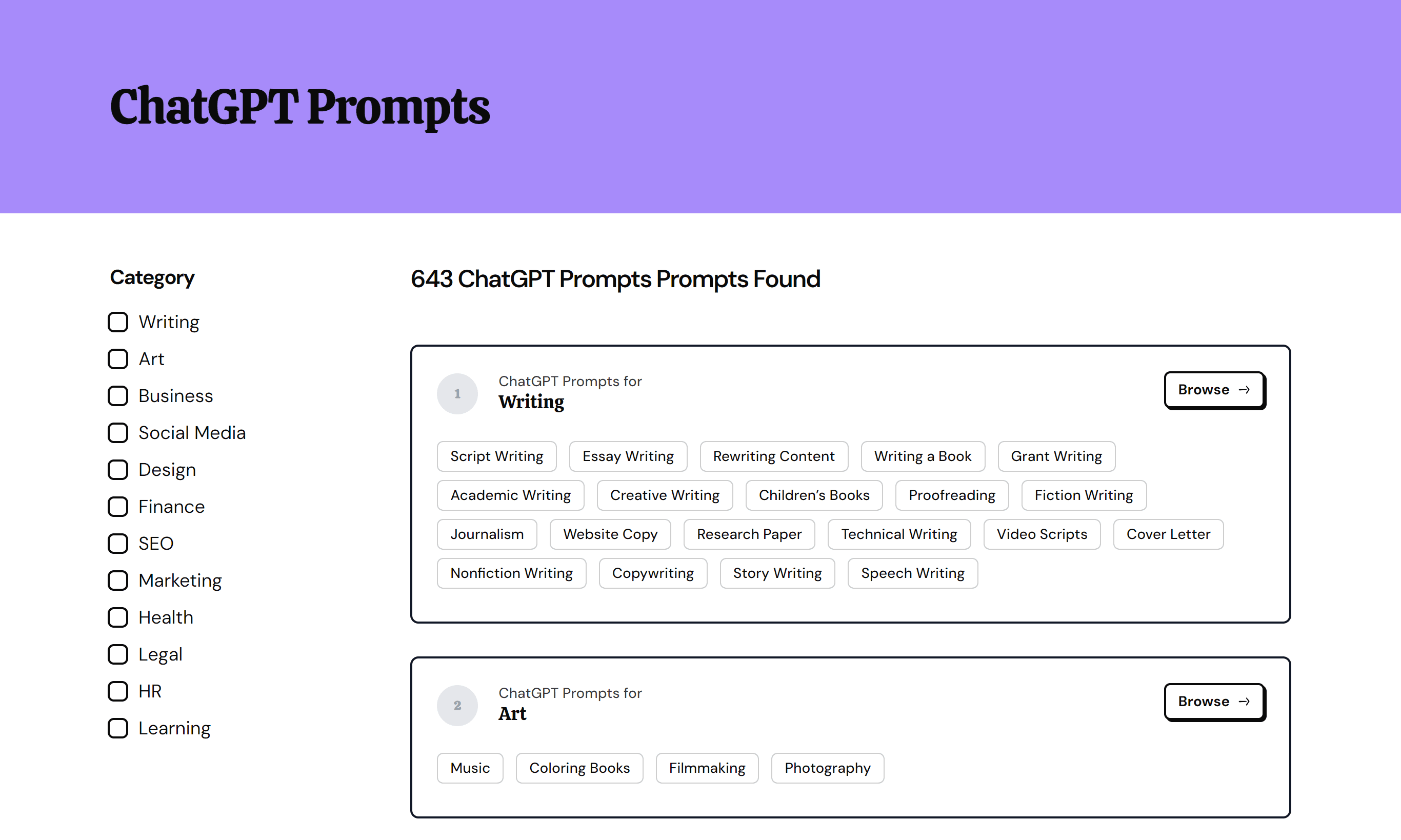
How To Generate Custom Prompts
Didn't find the prompt you need? Try our FREE ChatGPT Prompt Generator to generate one for you!
Final Thoughts
The world of UX design is vast and complex, but with the ChatGPT prompts discussed in this post, navigating it can become a whole lot easier.
By incorporating these prompts into your workflow, you can elevate your UX design, making it more intuitive, user-friendly, and engaging.
FAQ
Let's also address some of the common questions about using ChatGPT as a UI/UX designer.
Can ChatGPT help with UX design?
Yes, ChatGPT can help with UX design. It can generate user personas, draft conversational interfaces, or even help predict user responses. However, it's important to remember that while it can be a valuable tool, it doesn't replace the need for a skilled UX designer.
How can designers use ChatGPT?
Designers can use ChatGPT in various ways. They can use it to generate creative content for their design briefs, come up with innovative design concepts, and even draft compelling presentations to showcase their work.
Will AI affect UX design?
Yes, AI is already making an impact on UX design. It enables a more personalized user experience by understanding and predicting user behavior, automating tasks, and providing more relevant content.